
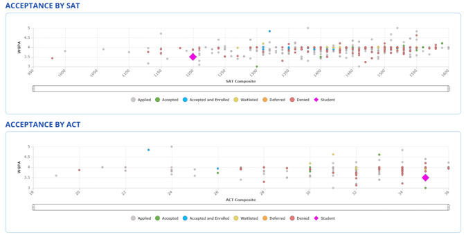
These charts show how students with different GPAs and test scores have fared in the admissions process, based on admissions outcome data collected in CounselMore.
What You’ll See:
X-axis
SAT Scatterplot → SAT score (1600 scale)
ACT Scatterplot → ACT Composite score (40 scale)
Y-axis:
WGPA – Displays the GPA of each applicant.
Note: The scatterplot uses the WGPA field for the Y-axis. If the WGPA is not filled in, the student (diamond) will not appear on the chart—even if a unweighted GPA is entered.
Color-coded Dots:
Each dot represents a past student’s outcome.
Gray  = Applied
Green  = Accepted
Blue  = Accepted and Enrolled
Orange  = Deferred
Red  = Denied
Purple Diamond  = Current Student
✅ Tip: You can click on each color in the scatterplot legend to toggle categories on or off, helping you focus on specific outcomes.
How to Use It
Compare Student to History: The purple diamond highlights your student’s GPA and test score, making it easy to compare with past outcomes.
Spot Admission Trends:
Green and blue clusters → successful ranges
Red clusters → less competitive ranges
Guide Conversations: Use patterns in the scatterplots to discuss target, reach, and likely schools with students and families.
Why It Matters
Scatterplots turn admissions results into a clear, visual story. They allow counselors and students to see where a profile aligns with past acceptances, while remembering that GPA and test scores are just one piece of a college’s holistic admissions review.
📊 All scatterplot data comes directly from CounselMore’s admissions outcomes reporting.